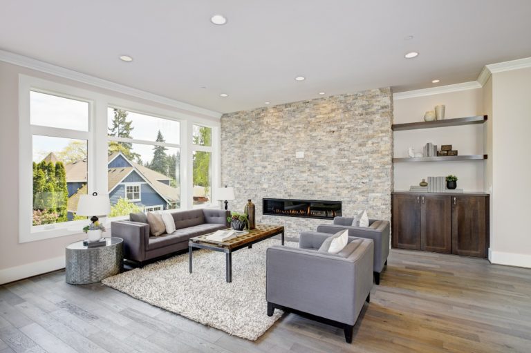
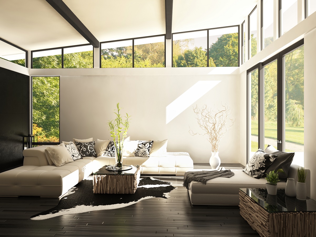
Gray may be the new cool. But, when you think of this color, images of sterility and plainness may immediately come to mind. Shades of gray aren’t necessarily associated with warmth, so if you want a cozy-looking space, this may not be your top choice of color. However, there are certain design ideas you can incorporate into your room to make this color work.
On their own, grays may seem drab but they make excellent foundation colors. You’ll be able to create a sense of warmth and comfort even in a room filled with gray by picking the right furniture pieces and décor, whether it’s your couch or dining table from Singapore. There may not be a single correct way to make a warm gray, but there are decorating choices you can make to add some touches of warmth and coziness in your living space.
Here are the do’s and don’ts you should know about decorating with shades of gray:
The Do’s
Think about the tone: not all grays are the same. There are those that fall under cool grays, while others are warm grays. The trick is to keep all colors in your room in one of those two available tonal lanes. For example, a crisp gray won’t go well with creamy white. If you’re thinking about painting your wall with a cool gray with blue undertones, your best option is to paint the trim with some cool gray white. Going with warmer whites will only make the room gloomy, not warm. For a safer choice, go with blues. Gray paints often work best if they come in warm or blue undertones.
Be smart with light: A room with gray paints or decors needs the right kind of lighting in order to look pleasant. If your room gets a lot of natural lighting, it’s best to go with a strong warm gray. If you aren’t blessed with a sunny room, a subtle cool gray can be complemented with some blue light.
Have a temperature test: A lot of designers seem to skip this important factor, but it plays a key role in a room’s entire palette. Because grays come in almost infinite shades – there are blue grays, cool grays, brown grays, and warm grays, among others – picking the wrong temperature can make the whole space’s color palette look imbalanced.
The Don’ts
Going with pink: When choosing a gray paint, make sure it doesn’t come with either pink or purple undertones. No matter how seemingly subtle those undertones are, they can have a huge impact on the vibe of your space. These shades just don’t work effectively as neutrals. To make gray work, the undertones should create a classic, soothing palette which will allow you to build and layer the rest of your other design elements to make the whole space look more cohesive.
Sticking to bold: On its own, gray may look dull, but it’s a great neutral that’s capable of complementing richer hues. They’re versatile, so you can combine them with jewel tones. Grays can work effectively in making a lot of vibrant colors stand out.